Launch price until Oct 31, 2026: $49. From Nov 1, 2026: $79.
Anti-Slop Kit: Neutral
Neutral default style
A calm, neutral design system your coding agent actually follows, so Cursor, Claude, v0 and Lovable stop shipping generic AI UI.
Your AI can build a product in an afternoon. It just looks like every other AI product. This kit gives your coding agent one clear, quiet look to follow: light surfaces, calm greys, one restrained blue accent and Inter, with every value named, so there's nothing left to invent. It uses the same token names as every Anti-Slop kit, so you can swap in another style later without rebuilding anything.
- Named tokens only — 3 radii, 2 fonts, 6 product type sizes, one spacing scale and one accent, so agents have nothing left to invent
- Short imperative rules in AGENTS.md and .cursorrules the agent reads before touching UI
- Explicit anti-patterns list — agents follow “never do X” better than “make it elegant”
- Same token names as every Anti-Slop kit, so styles are interchangeable
Make it yours: colors & fonts
Neutral is a starting point, not a cage. Every color and font lives in tokens/tokens.json — change the blue accent to your brand (plus hover and subtle shades), re-tune greys, borders and status colors, or swap Inter and Roboto Mono for your own typefaces. Run node tokens/build.mjs and CSS variables plus the Tailwind preset update together; ask your agent to update DESIGN.md to match so it follows your new look from then on.
What's included
- Figma — Anti-Slop-Kit-Neutral.fig, 3 pages; 27 colour variables, spacing and radius variables, 13 text styles; 17 components with variants; 4 example screens (first visit, invoice review, settings, orders with no results)
- Figma note: component set differs from the 13 code components; screens are generic, not the Halden Ops routes in the app
- Agent rules — DESIGN.md, AGENTS.md, .cursorrules
- Tokens — tokens.json, tokens.css, tailwind.preset.js, build.mjs; Inter + Roboto Mono; 3 radii; 4px spacing scale; token check script
- Code — Vite + React + Tailwind; 13 React components (Badge, Button, Card, CheckboxField, EmptyState, Field, InfoStrip, InlineAlert, PageHeader, SideNav, Table, Tabs, TextLink)
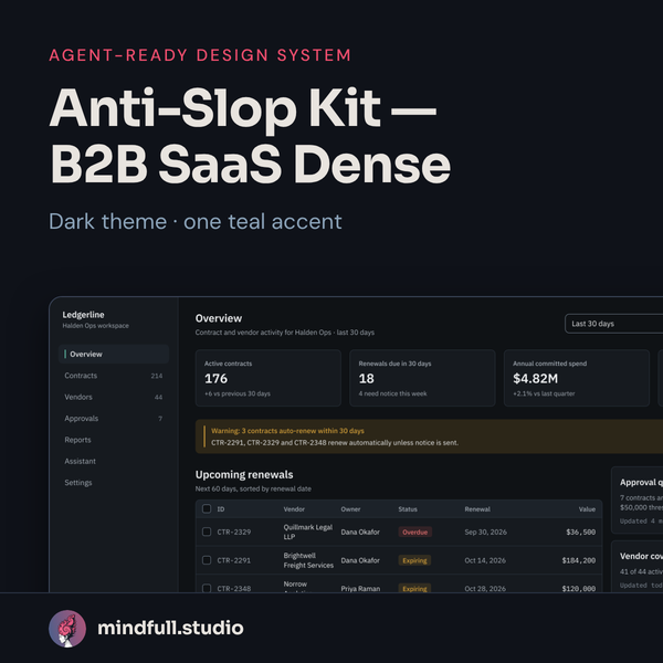
- Screens — 10 Halden Ops example pages: Sign-in, Overview, Vendors, Vendor detail, Contracts, Approvals, Reports (empty), Assistant, Settings, Error / permission denied
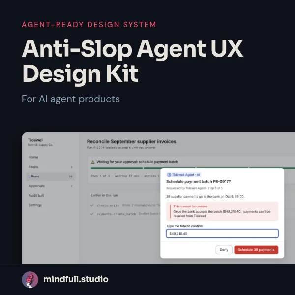
- README quickstarts, LICENSE.txt; agent UI primitives ship in the Agent UX kit
Who it's for
- Founders and small teams building products with Cursor, Claude Code, v0, Lovable or Bolt
- Anyone who wants a quiet, credible default look instead of an AI demo
- Teams tired of re-explaining “the vibe” to their agent every session
Who it's not for
- Consumer or playful apps — this system is deliberately calm
- Marketing or landing pages — built for the product, not the website
- Anyone looking for hundreds of unrelated UI blocks