Launch price until Oct 31, 2026: Solo $119, Team $299. From Nov 1, 2026: Solo $149, Team $349.
Anti-Slop Agent UX Design Kit
Agentic product UI
Figma, code, and rules for products where an AI agent plans, acts, asks permission, undoes, and logs — not just chat.
Most AI features stop at a chat box. The Anti-Slop Agent UX Design Kit is for software where the agent does work on the user's behalf: propose a plan, execute steps, pause for approval, roll back, and leave an audit trail. It ships ready-made disclosure UI patterns, uses the same token names as every Anti-Slop kit so any Anti-Slop style restyles it, and includes a neutral default look out of the box.
- Patterns for plan → act → ask permission → undo → log, not chat-only flows
- Ready-made disclosure UI components and copy starters for agent-generated outputs
- Same token names as every Anti-Slop kit — swap styles without rebuilding logic
- Neutral default style included; restyle with any Anti-Slop pack later
Style with any Anti-Slop kit
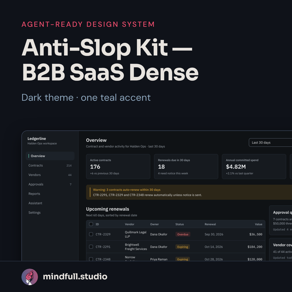
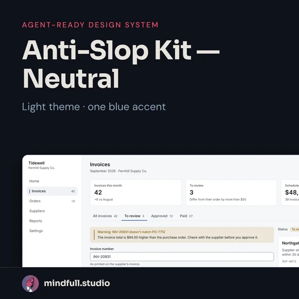
The kit's logic and tokens are style-agnostic. Drop in Anti-Slop Neutral, B2B SaaS Dense, or your own token export — the agent rules and component contracts stay the same.
What's included
- Figma — Anti-Slop-Agent-UX.fig: 17 base components, 10 agent components, disclosure UI (AIBanner, AIMark, GeneratedLabel), 8 Tidewell agent screens
- Figma agent components: PlanPreview, PlanStep, AutonomyDial, RunProgress, ToolCallRow, PermissionGate, UndoToast, RecapCard, AuditEntry, FailureEscalation
- Figma — Anti-Slop-Neutral-Base.fig: 17 components (Button, Input, Textarea, Checkbox, Toggle, Badge, Card, PageHeader, Wordmark, Tab, Tabs, NavItem, SideNav, InlineAlert, Toast, EmptyState, Modal) and 4 generic example screens (not Halden Ops)
- Agent rules — DESIGN.md, AGENTS.md, .cursorrules, plus agent-ux skill (SKILL.md) and a UI lint script for colours, labels, destructive actions, and disclosure accessibility
- Tokens — tokens.json, tokens.css, tailwind.preset.js, build.mjs; Neutral and B2B SaaS Dense restyle fixtures; token checks for the example app and base components
- Code — Vite + React + Tailwind example app with 13 base components, 10 agent components, and 3 disclosure UI components
- Screens — 8 Tidewell agent screens plus an “All states” page; 10 Halden Ops base pages (Sign-in, Overview, Vendors, Vendor detail, Contracts, Approvals, Reports, Assistant, Settings, Error)
- Solo — everything above; licence for one person
- Team — Solo plus team/components package of 20 shadcn-style React components (CVA variants, Radix Slot): 13 base, AIBanner, AIMark, GeneratedLabel, AutonomyDial, RunProgress, PermissionGate, AuditEntry; demo app; organisation licence
Who it's for
- Teams shipping agentic features in real products (not demo chatbots)
- Founders who want disclosure and permission UX in the product from day one
- Designers pairing with Cursor, Claude Code, v0, Lovable, or Bolt on agent workflows
Who it's not for
- Simple chat UIs with no tool use or side effects
- Teams that only need a color palette — start with Anti-Slop Neutral or B2B SaaS Dense
- Marketing sites — this kit is for in-product agent experience